Mono Selfstorage
Branding
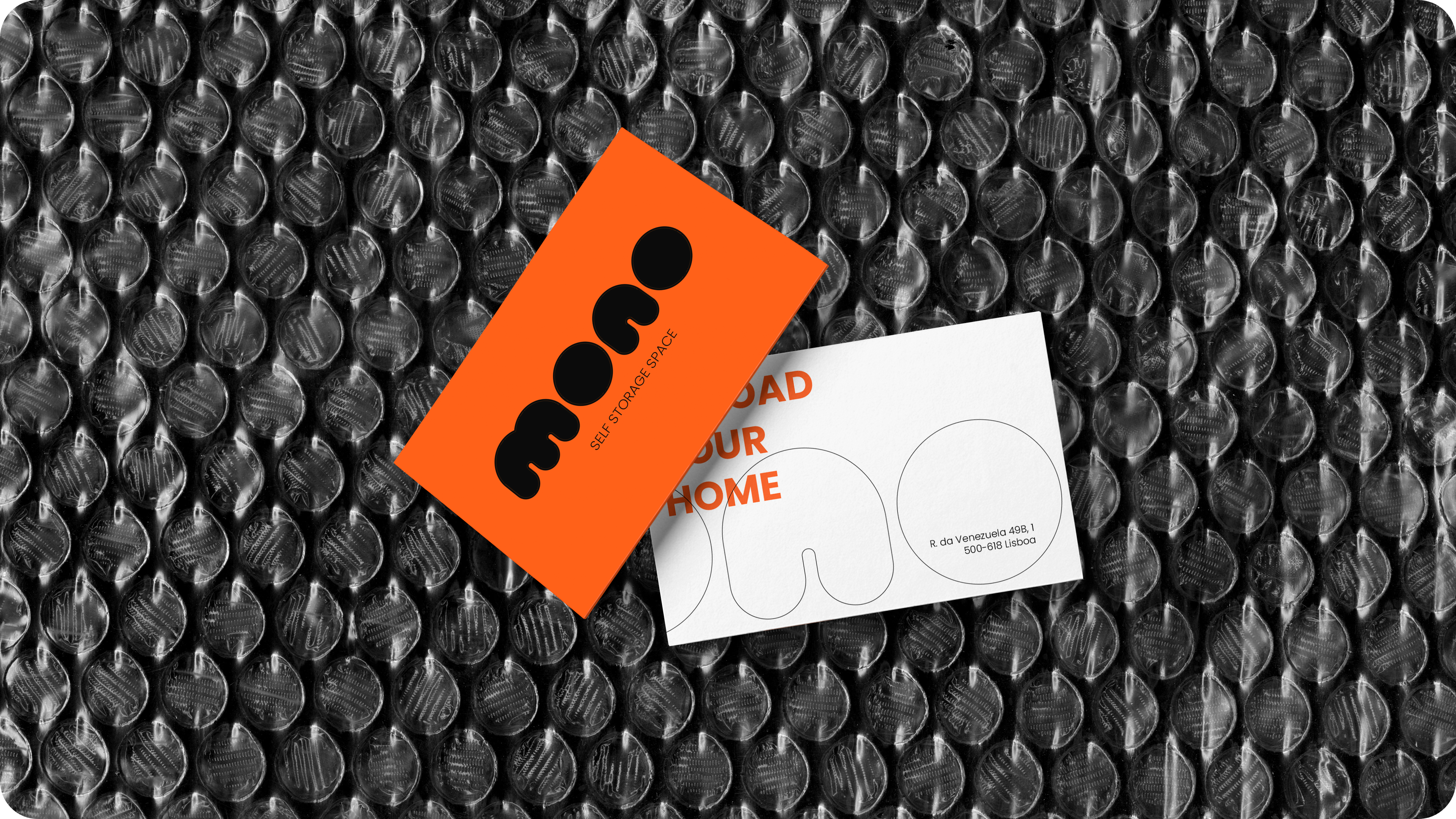
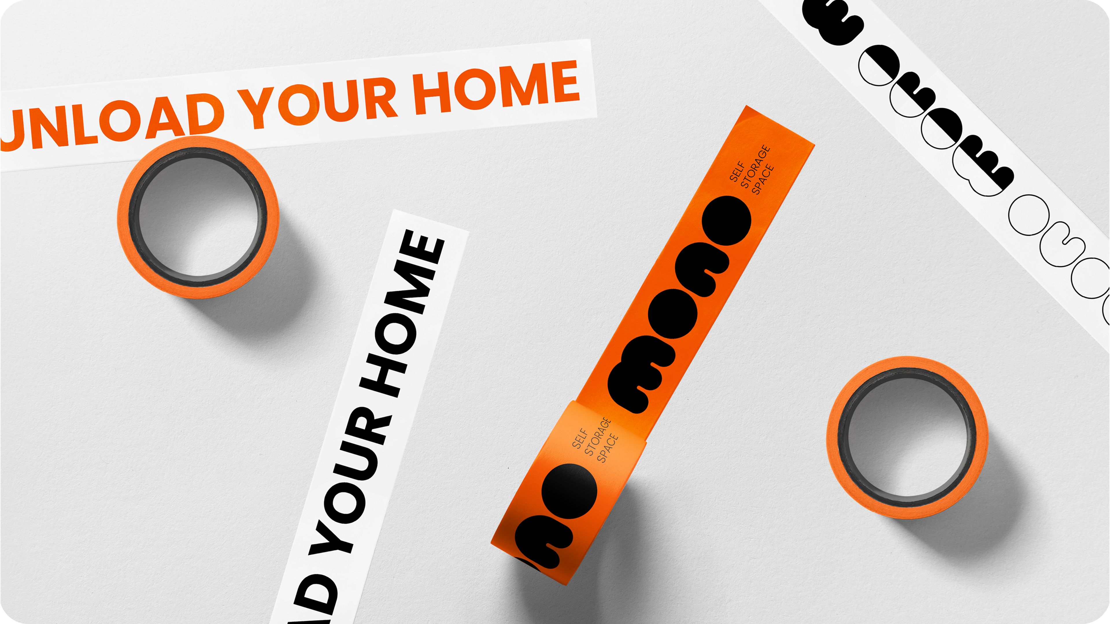
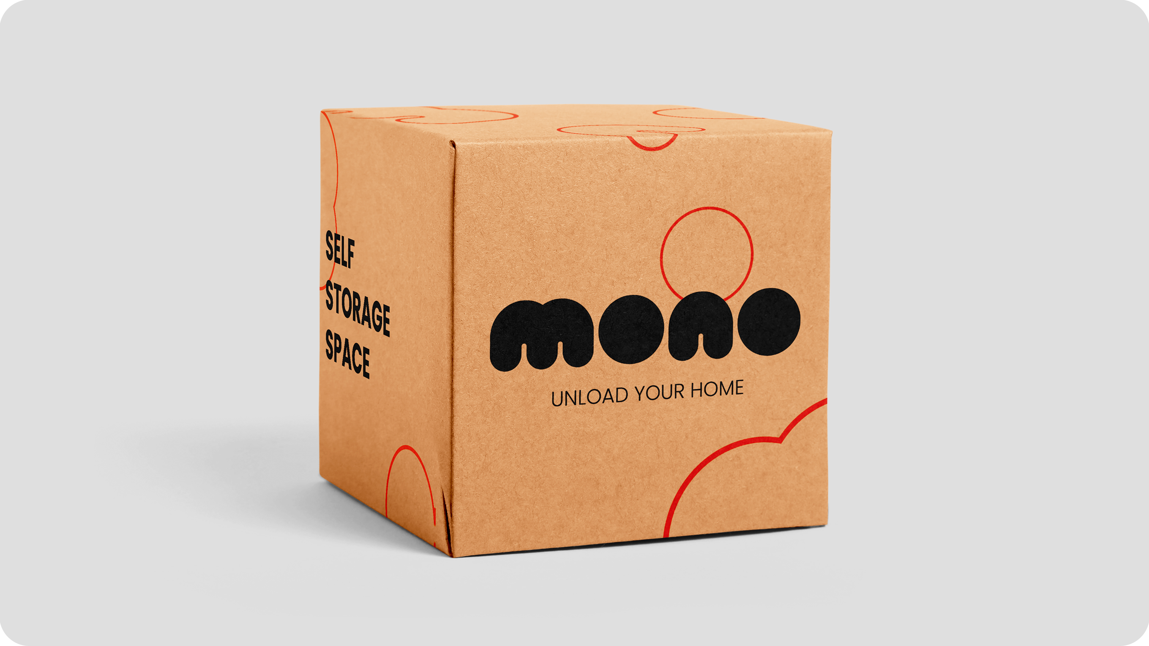
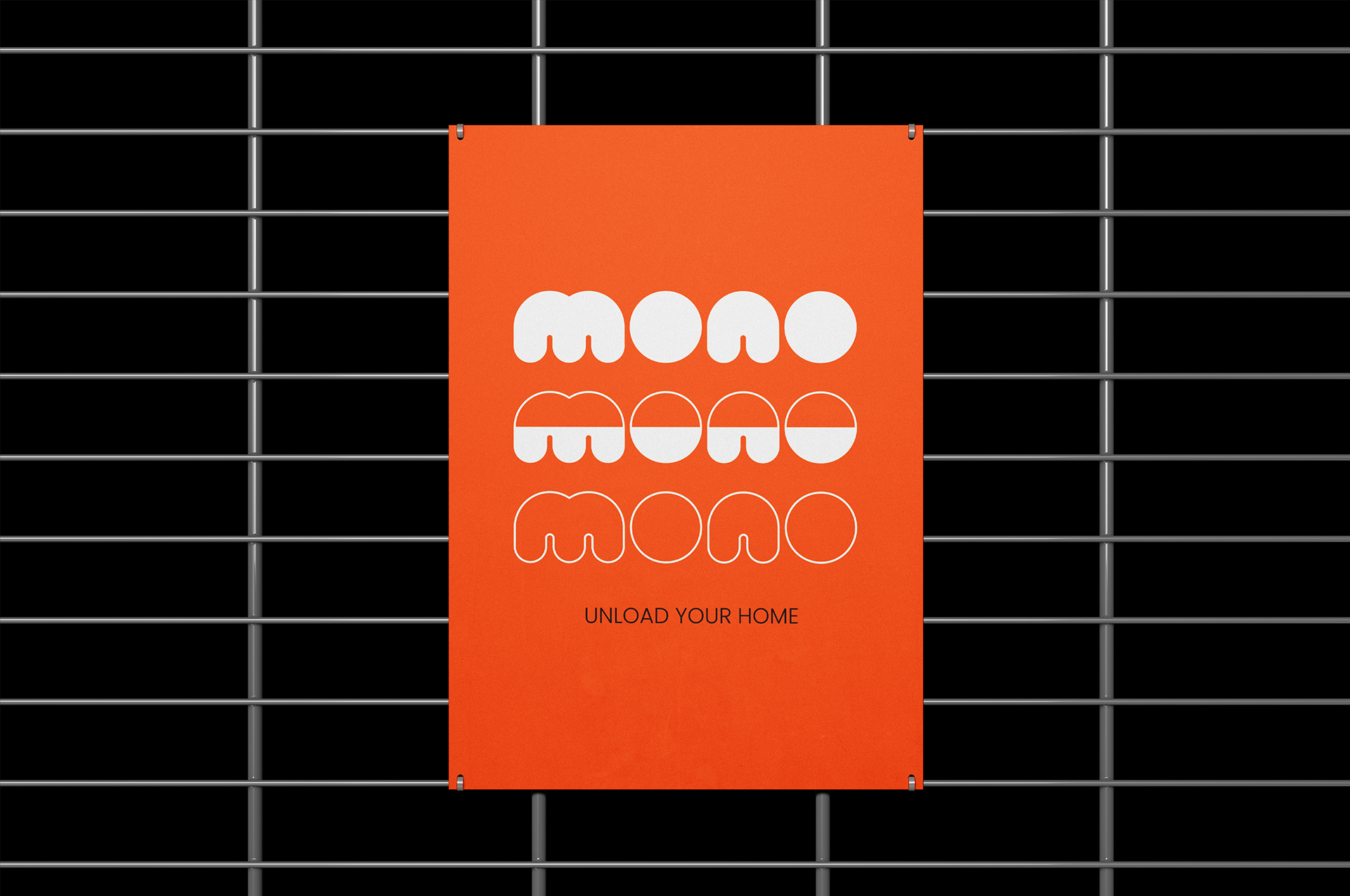
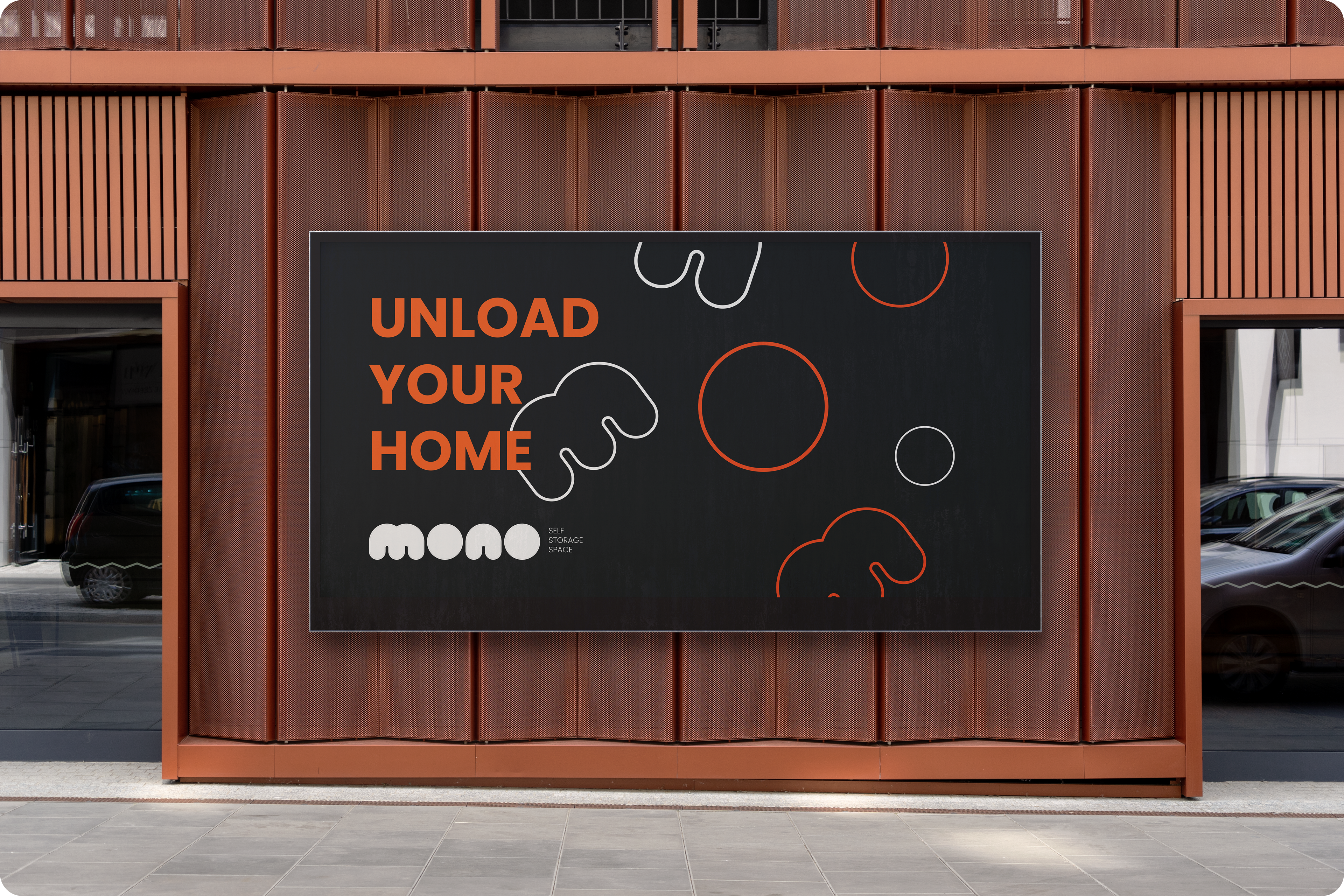
This project focused on creating the identity for a self storage brand, from naming to visual system. The name Mono comes from a Portuguese word used to describe objects we no longer use daily. The tagline “Unload your home” reinforces the idea of freeing up space without discarding what matters.
Visually, a rounded and friendly typeface was chosen to soften the impact of the name and move away from a cold or purely functional approach. The visual language reflects the idea that not all “monos” are negative, actually many of them represent memories from a happy past that simply need a new place.